Selected work · 02
Design System KOMPAS.com
Built KOMPAS.com's design system: 1,300+ variables, an atomic component library, adopted by every product designer and mirrored in code by engineering.
- Role
- Lead Designer & Sole Architect
- Status
- Live · Adopted across KOMPAS.com
- Scope
- KOMPAS.com · Team of product designers

The Problem
KOMPAS.com scaled fast. Consistency didn't scale with it.
The team grew. The product surface expanded across pages, sections, and product lines. Designers worked in parallel. What kept up: shipping speed. What didn't: consistency.
The trigger
KOMPAS.com began a massive development push when the pandemic accelerated digital news consumption. Designers were redrawing the same components in different files. Engineers were re-implementing the same patterns with slightly different values. Every new surface looked a little bit different from the one before it.
What the audit found
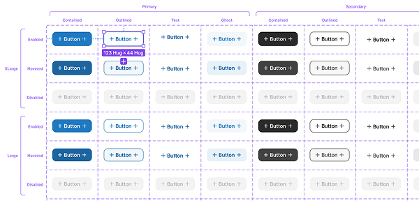
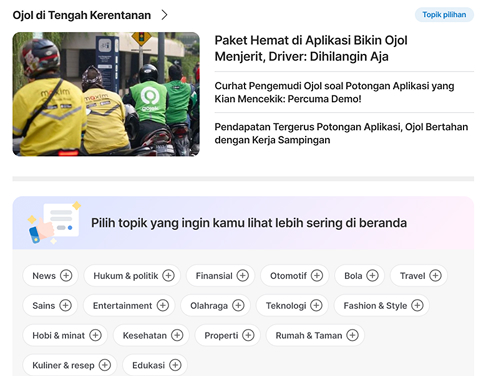
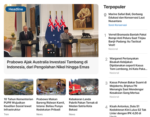
No shared spacing scale: designers were eyeballing margins. Color values defined inline in ~80% of components, resulting in dozens of slightly different shades of the same brand color. Buttons built one-by-one, not as components: every instance had its own spacing, type, and color. Different shadows and elevations for the same visual layer. No shared type scale: sizes drifted across pages.
From Initiative to Mandate
The project started informally. The need was already obvious.
Not all systems start with a mandate. This one started with noticing a problem and choosing to fix it.
How it started
I started fixing the inconsistency informally: building shared variables, refactoring the components I touched in my own work, documenting patterns as I noticed them. The work wasn't assigned. I did it on the side because the problem was slowing the whole team down. A senior designer noticed. The informal fix became an official project: build a design system for KOMPAS.com, owned by me.
How the work was structured
The design system was built by a team of product designers. Designers drafted components, new patterns they needed, gaps they encountered in their own work. Senior designers reviewed and approved at the draft stage. My job: refine every approved draft to system standards, connect it to the variable architecture, fit it into the atomic structure, document it, and ship it into the library. The drafts came from the team. The architecture is mine.
How I approached the system itself
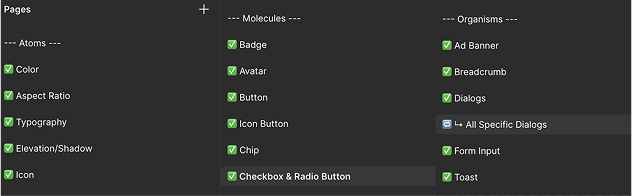
I worked atomically, in three tiers (atom, cell, organism), so the system would scale predictably as new components were needed. The audit findings drove the foundation: shared spacing first, semantic color second, type scale third, component patterns fourth. By the time I started designing components, the rules were already in place. Nothing was being decided ad hoc.
The Architecture
Three tiers, 1,300+ variables, two themes.
The system is structured so a brand-color change touches one primitive and propagates automatically through every component that consumes it.
Token tiers
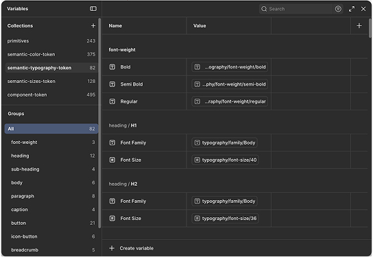
The system has three levels of tokens, each with a specific job. Primitives (243) are raw values: colors as hex, sizes as numbers, no semantics attached. Semantic tokens (585 total) reference primitives. This is where dark and light mode resolve: text/primary returns a different primitive in dark mode than in light mode. Component tokens (506) are what components actually consume. A button never references a hex value — it references button/primary/background, which references surface/action/primary, which references a primitive.
Why three tiers
Without this separation, any change to a brand value means hunting every component that references it. With three tiers, scope changes, rebrands, or theme updates each touch one layer and stop there. Designers using the system don't think about hex values. Engineers consuming the CSS library don't either.
The Decisions That Shaped It
Three system-level choices that took the longest to get right.
System-level choices outlast the sprint they're made in. Getting any one of them wrong would have meant unraveling the foundation later.
Type scale — stakeholder needs vs. UX needs
Button text, body copy, headers, and editorial content all wanted different things from the same type scale. Stakeholders had opinions about what looked right. UX needed sizes that worked for readability and tap targets. I worked through scale variants until the values served both, then locked them into semantic typography tokens so the decision wouldn't have to be re-litigated every time someone built a new screen.
Dark and light mode at the semantic layer
Dark and light modes had to coexist in the same component definitions. Building them at the primitive layer would have meant every component referencing two color values and switching by context. Fragile and unmaintainable. Resolving them at the semantic layer meant a single set of tokens like surface/elevated returns the right value automatically based on mode. Components don't know whether the system is in dark or light mode. They just consume their tokens.
Elevation layering and contrast
The hardest visual decision was how layered surfaces, modals over panels over cards over backgrounds, maintained enough contrast at each level to feel distinct without becoming heavy. I designed a system of surface tokens that escalate luminosity step-by-step through elevations, with shadow values calibrated to each level. The result is a stack that reads cleanly whether the system is in dark mode (where elevations get lighter as they rise) or light mode.
What Shipped
Adopted by every designer, mirrored in code.
Adoption
Every product designer at KOMPAS.com uses the system. New work is built with it. Older surfaces migrate to it one at a time as they get touched. The library is a requirement, not a recommendation.
Engineering counterpart
The development team built a CSS library that mirrors the Figma system. Component tokens, semantic values, and atomic structure are consumed in code the same way they're consumed in design. Design-to-code handoff stopped being a translation problem. As one engineer put it: "This will cut our workload since every style is predefined. We just call the class instead of hardcoding it."
What changed
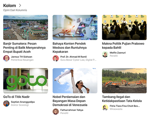
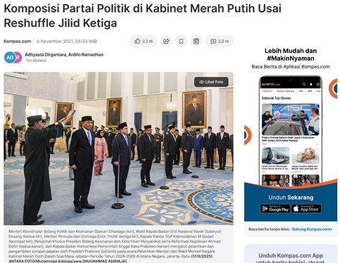
Shipping is faster. Engineering rework dropped. Cross-surface consistency is visible to anyone using KOMPAS.com. The system was 80% complete when I handed it off, with the variable groupings still on my list and the next iteration already in progress. The clearest change is in the conversations: designers stopped debating what color or spacing something should be, and started debating what a screen needs to do.